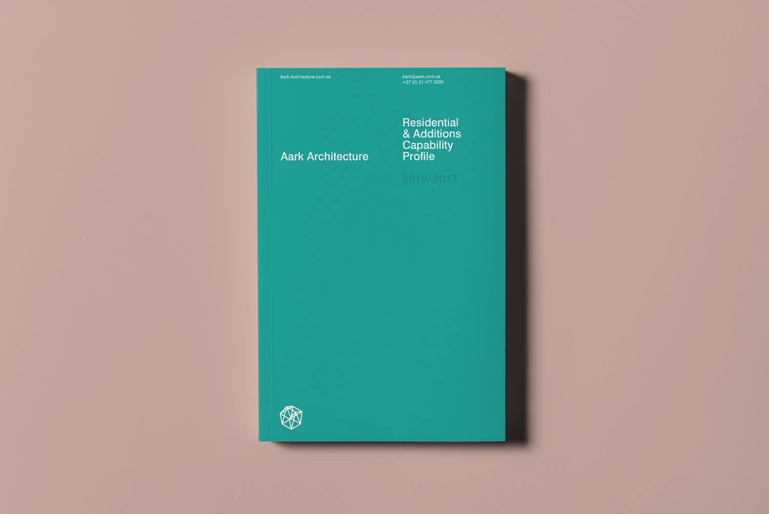
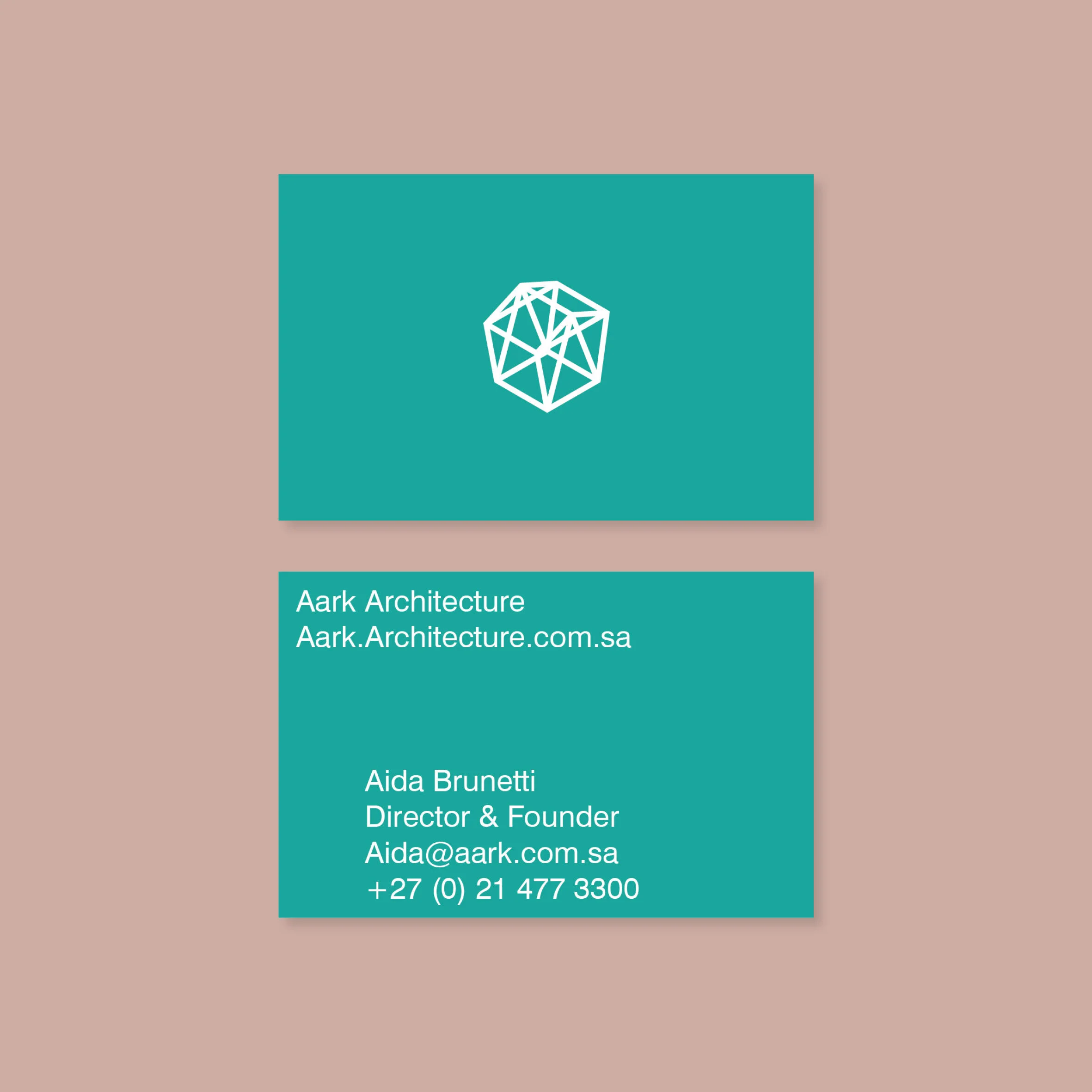
Aark Architecture – logo and brand identity for small architecture practice specialising in small-scale timber construction.
The logo design has structural properties and began as the letter 'A' (for Aark) enclosed within the tapered silhouette of a house cross-section which was then duplicated (for the double 'A' in Aark) and given three dimensions. The result is an abstract form that subtly represents that of a building structure and hints at the small-scale nature of the practice’s work.